Categories
Design UX

Master of Science in User Experience Design (MSUXD)…. CHECK!

First:

It’s official. I have graduated from Kent State University with a Master of Science in User Experience Design! Over the past 2 years there were many times that I considered not finishing the degree.

I often questioned why I was putting myself and my family through this. It wasn’t easy at this stage of my life. But with the support of an amazing wife Alexa Seretti, son, family, and friends I was able to get through it!

I can’t thank those that helped enough.

Second:

I have had people ask me, “Did you really need to get a Master’s Degree in UX?”

The short answer is NO. I have 13+ years experience of real world… hands on… in the weeds design experience that no class can teach or that no one coming from another field could match. I love my career so far but that’s not why I decided to do this.

The long answer is YES. I didn’t NEED the degree… I WANTED it. I wanted to have a refresh in the field… I wanted to continue to learn… I wanted to understand and get experienced in the branches of UX that I didn’t have a ton of exposure to (Research… Content Strategy… Information Architecture). As a UI designer by trade I knew I needed to round out my skill-set.

Most importantly, I wanted to be even more of an advocate for the user.

Now…when a fellow UX Designer or Manager or Director asks me that question, I wonder ‘What truly makes them qualified to call themselves a UX Professional?’  What qualifies anyone to call themselves a UXer? That is the real question the industry is going through at this point. There are a TON of posers out there (See Darren Hoods posts about this topic on LinkedIn https://www.linkedin.com/in/dwhood). There are also a lot of people, unfortunatly, in positions of power in the industry who are potentially leading the practice in the wrong direction and hiring other posers.

I’m not saying the degree makes me a better UX Professional… but it sure as hell doesn’t hurt.

Categories
Design Mobile Strategy UX

Top 3 Must-Read Books of 2015 for Digital Creatives and UX Designers (and 2 more)

If you’re looking for a holiday gift for the designer in your life, here are a few highly recommended books that were published in 2015.

I can usually make it through 5-10 trade books a year. I’m not sure if that number is good or bad, but it’s an honest one for me. 2015 has been a great year for design books and I wanted to share my top 3 favorites. The list would be 5-strong but the last 2 I haven’t read yet as they were just released.

These are in no particular order.

RWD_danrose Responsive Web Design with Adobe Photoshop 1st Edition by Dan Rose (@dblizzy)

Here is the quick review I put on Amazon via my phone shortly after reading: “This book is a must read for any UI Designer that still appreciates being creative. Easy to read and invaluable for anyone who is struggling with the idea that you should design in the browser. This book does a great job of showing and proving that that isn’t the case. I’m going to make this a required read for my UI desig team.”

On the surface, you may think that this is a technical manual that simply walks you through how to design a responsive site with Photoshop. That’s not the main point of this book (though there are some great tips and tricks) and not what Dan’s motives for writing it were in my opinion. Instead, he jumps right into the “great design debate” of the past couple of years as to whether or not it’s right or wrong to design responsive experiences in the browser or in a tool like Photoshop.

If you are someone who is a mid to advanced user of Photoshop and are feeling the pressure from other designers and developers in the industry to move away from Photoshop and you don’t agree, then this book if for you. It will help you show through example why it’s not old school to use Photoshop for web design. After reading Dan’s book I solidified my stance that what is great about UI design is that it’s a creative field (that dabbles in being technical) and that it’s best to use the tools that make you comfortable so that you can be as creative as possible. You should never hold back your designs because of the tools you’re using.

I felt as if some of the pages of this book were penned by me and it echoed my theory and philosophy of RWD. If you still value being “creative” and Photoshop is your tool of choice, pick this book up and keep it by your side when you’re designing. You’ll learn new techniques that can help streamline your process and make sure you think of all the in’s and out’s of designing a responsive site.

ArticDesign
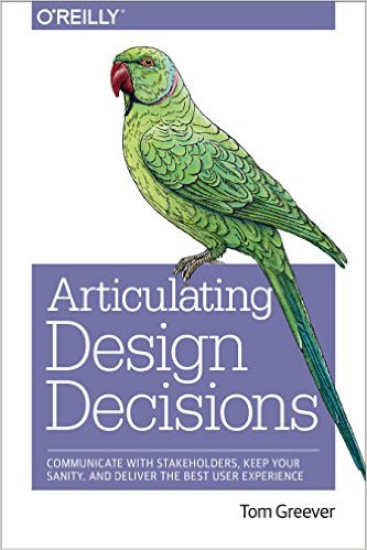
Articulating Design Decisions 1st Edition by Tom Greever (@tomgreever)

As I progress though my career I am able to recognize my strengths and weaknesses faster. Because of this I’m also able to find solutions to the weaker parts of my skill set and nip that weakness in the bud.

One thing that I’ve been proud of over the years is my ability to articulate my designs, at least I thought that was the case until maybe the past 1.5 years or so. With the ever evolving world of web design comes challenges to be able to explain the “why’s” behind you and your teams designs. At some point you think that your experience should just speak for itself. The problem is that time really NEVER comes.

I decided to pick this one up after one particularly bad meeting where I wasn’t able to explain why I had directed my team to do something. I realized that the medium is moving way way faster than some of the C-Suite Execs are able to keep up.

This book is a great tool to help refine and sharpen the skill set of selling your ideas and is highly recommended for any designer out there.

touchDesigning for Touch by Josh Clark (@bigmediumjosh)

Josh Clark has done a great thing for the design community by writing this book. I’m about 95% through this one and I’ve already used it in my day to day work more than once.

If you’ve ever designed anything for a mobile device you know that it’s just not as easy as saying “make the text bigger and make that button tapable!” there is way more to it and Josh does a great job explaining the nuances of designing for these new devices and sizes without getting too far into the weeds.

There are real-life examples throughout this quick read and best of all this book is up-to-date. One of the reasons I wanted to read this was to see if and how the differences between phone screen sizes and the rise of the “phablet” have effected design techniques or touch design philosophy. The answer is in this book and it’s valuable information that every designer should have. I just hope they keep updating it as new and unexpected trends in this market emerge.

Just Bought; Haven’t Read

A Book Apart, the publisher of Designing for Touch, also just released 2 new titles that I’m waiting to get in the mail as I type this. I wanted to mention them as they are relevant to my work right now and knowing the quality of A Book Apart, I’m sure these will be amazing.

Responsive Design: Patterns and Principles by Ethan Marcotte (@beep)

Written by the guy that coined RWD, this is a must read. Here is the description: “As responsive design evolves, we have a critical need to think about design challenges beyond mobile, tablet, and desktop. When properly designed and planned, design patterns—small, reusable modules—help your responsive layout reach more devices (and people) than ever before. Ethan Marcotte shows you just how that’s done, focusing on responsive navigation systems, re-sizing and adapting images, managing advertising in a responsive context, and broader principles for designing more flexible, device-independent layouts.”

SO GOOD! I CAN’T WAIT

Going Responsive by Karen McGrane (@karenmcgrane)

The reason I want to read this one is simply because I am a realist and this book sounds like it’s trying to teach people the truth about the real world of design. From being on both the agency side and client side there are a lot of challenges that come along with “going responsive.”

I read Karen’s book “Content Strategy for Mobile” and I’m sure this one will not disappoint. Here is the description: “Responsive design is more than the technical; it’s a new way of communicating and working that affects every person on your team. Karen McGrane draws on data and stories from real-world teams to show you why going responsive is just good business sense—and how to set up your project (from concept to launch) for total success. Learn how to plan and scope work, collaborate in a responsive context, evaluate content, handle browser support and testing, and measure performance outcomes. No matter your role or project, go responsive with confidence.”

Categories
Design Development

I’ve been saying this for years… Designers should design and Coders should code

Fast Company Design posted an article today titled “Designers Should Design, Coders Should Code.” It’s an awesome read and it’s something I’ve been saying since about 2004 when I finally realized that my coding skills were not evolving as fast as my design skills. I made the conscience decision on that day to stop lying to myself. I stopped trying to be something I wasn’t… a coder. I committed then and there to be the best designer I could be and let the developers of the world turn my designs into reality.

It was humbling but freeing at the same time. What I learned when I did this was that I was able to focus on solving problem and solving them in the best way possible. I no longer had to dumb down my designs to my coding skill level. This is when I feel I truly became a designer.

Over the years I’ve had many debates with people who think they are, or can find a unicorn that can both design and code. They call these people “UNICORNS” for a reason, they don’t exist! If you think you’re a unicorn, I’m 100% positive I can show you a designer that is better and more creative than you and a coder who can code circles around you.

This is still a controversial topic and one that will probably never go away. But reading the above article just re-engergizes me and give me hope that others are finally coming around to the myth of the unicorn.

Another good read about this: Why Designers Should Not Code (written by a “unicorn”)

Categories
Design Development Mobile Strategy

Some think RWD isn’t the long-term solution for the mobile future???

Yesterday Brad Frost (@bradfrost) tweeted this:

The link lands you on an article from Mobile Marketer titled: Responsive Web design not a long-term solution to mobility: Forrester

Please take a minute to read this article so you can do this:

I can’t decide if this article is meant to stir the pot and get people like Brad, Luke, me, and any other RWD evangelist up in arms, or if they are serious. My fear is that the survey they took is legit and it is sadly eye opening OR as one person commented, “Guys, this is just a commercial for Moovweb who is trying to coin a term “Responsive Delivery”. Shameless.”

The article points out that RWD is too complex and that too much cost is associated with moving to RWD.

One of the main issues with responsive Web design is that it requires the code for a company’s existing Web assets to be completely rewritten, making the project more complex than some expected.

We didn’t really need proof that most sites have been put together like Lego’s over the years, plugging in things here, adding 3rd party software there, etc. The move to mobile is simply making these bad development decisions more visible. IT departments don’t want to admit they were wrong and I think it’s very short sighted of those involved to write RWD off:

“One of the biggest things that came out of this was that responsive Web design was viewed by the majority of the respondents as a tactical short-term solution,” said Mitch Bishop, chief marketing officer of Moovweb, San Francisco.

The comments on this post are great:

“This article is an example of what happens when non-developers write about development. Check your facts – RWD does not require companies to “rewrite their code base”. The whole point of RWD is to have one code base.

So many inaccuracies in this article, it boggles the mind.”

and this one is pretty much exactly what I thought the first time I read this garbage:

Have you lost your mind?

Responsive web design is all about the front-end. RWD itself DOES NOT require “back-end” changes unless the previous front-end and back-end code are poorly written and intertwined – and if so that is NOT the fault of RWD.

Who paid you to post this collage of gibberish, doubletalk, half-truths and outright lies?

Sigh.

Categories
Agencies Design Strategy

There Is a Digital Talent Gap – Infographic

I found this infographic gem from a former MARC colleagues twitter feed (Courtney McHugh, follow her here: @courtneycostelnock) and it really solidified some feelings I’ve been having about the industry as of late: Where is the talent?

Check it:

Talent Gap
Where is the Digital Talent


Categories
Design

FlatOmorphic – A hybrid approach to the Flat vs. Skeuomorphic debate

While I am a HUGE fan of FLAT user interface designs, and I am happy we’re moving away from the extreme skeuomorphic styling of previous versions of iOS, I feel some designers have taken this trend to a level that is only hurting user interfaces. The problem is that as designers we tend to take the hottest trends to far (remember Web 2.0?). But flat design doesn’t have to lack depth or significance, and we should just stop the insanity now.

There have been 2 great articles that have come out the past week that support this.

A List Apart just released an excellent article talking about how Flat UI and Forms have some potential issues.

Though some decry flat user interfaces as pure fashion, or the obvious response to skeuomorphic trends, many designers have embraced the flat approach because the reduction in visual styling (such as gradients, drop shadows, and borders) creates interfaces that seem simpler and cleaner.

The problem is that most flat UIs are built with a focus on the provision of content, with transactional components (i.e., forms) receiving very little attention. What happens when flat and forms collide? User experiences can, and often do, suffer.

iOS7 is the biggest fail of the flat design trend I think I’ve seen to date. But don’t take my word for it, it was just my initial gut reaction to the extreme flat-i-ness of the new mobile OS. Instead take the word of renowned usability experts, The Nielsen Norman Group. They have just release an analysis of the new iOS7 and how the flat design has really taken away from some of the experience that made the iPhone so popular. The summary of the article says it best:

Flat design hides calls to action, and swiping around the edges can interfere with carousels and scrolling.

This article is great because they really do a good job of pointing out what is wrong with the bigger issues with the OS, let alone the Flat design aspects.

Case in point, the Mail settings page in iOS7 has some issues and not all of them can be blamed on Flat UI. I blame simple bad design.

For instance, when configuring an email account on the Mail page under Settings, there are several tappability cues:

  • Blue color in the navigation bar (<Mail in the top left corner) – this takes advantage of the previous web knowledge (blue is a link on the web) and iOS knowledge (items in the navigation bars are tappable)
  • Arrow in a table view (next to Mail Days to Sync) – this also relies on previous iOS knowledge
  • Toggle switches that look like sliders that can be moved
  • Red color, text centering, and position at the bottom of the page for Delete Account – these are all weaker cues, but they all reinforce each other
Mail page under Settings in iOS 7

So…..

My suggestion to fellow designers is that we take hybrid approach. There can be a middle ground between Flat UI and Skeuomorphic trends that I think can deliver the best user experience.

I’ll coin this style “FlatOmorhpic”. I’m not suggesting we bring back the odd and overdone “stitching” from the iOS Address Book app. No, all I’m saying is that it’s OK to use some old tricks when needed. As designers, it’s our job to make sure the user can do what they need to with our product. If that means putting a drop shadow on form field or rounding corners on a button to differentiate it from something else…. so be it. We shouldn’t be judged by the trendy style of our designs, but the usability of it.

Categories
Design

Genius Designer – Are you one?

So there has been a lot of talk lately as to what is the best approach to digital design. Should it be user focused? Should it be data driven? How much does any of that matter? Can data driven design be the wrong approach?

Well last night my wife (@alexaseretti) and I got into a discussion about a 3rd type of designer or design team. The GENIUS DESIGNER. From a great article by Jared Spool:

Genius design is a sophisticated approach to making design decisions. Through deep study of similar projects, a team learns what works and what doesn’t. This makes the team more valuable over time, bringing it to a new level with every subsequent project. We’re seeing more teams take the plunge with the genius design approach. It’s a great way to move away from the commoditization of design work, while delivering real value to clients.

I personally consider myself a hybrid between a user focused designer and a genius designer (although I think that title is cheesy). My career has focused me on 4 particular “genius” subjects. Financial, eCommerce, Healthcare and more generically Branding. Any designer who has spent any amount of time with a client or working in-house has probably developed some of these “genius” skills.

I think this all leads me to the approach Google has taken in the past couple of years. It’s a cross between focusing on the user and the data but letting the designer, the “genius”, add their 2 cents. They can really help focus the design taking into consideration the other factors and adding a style to things that is just as important. This has proven to work for them and it shows.

Categories
Design Development UX

Jack of all trades, master of none? I think not.

Is a line being drawn in the sand about what makes a Web Designer?

Possibly. While i agree with some of this excellent article written by GORKA MOLERO, there are some parts of it that are a stretch for me.
I have a lot of respect for Andy Rutldge but I’ve never really agreed with this:

‘A designer who does not write markup and css is not designing for the web, but drawing pictures’

I think there is always going to be a seat in the room for a UX/UI designer that isn’t necessarily an expert at Front-End/CSS or jQuery. Personally I would trust a UX/UI designer to craft the look and feel of a site/product over an expert coder. I mean, have you seen sites created by IT teams or people that have spent the past few years becoming an expert coder? YIPES! I think a designer and developer is a team not one person. This team should be the best at what they do and be able to finish each others sentences so the product is as good as it can be. They should be able to talk each others language and even dabble a bit in each others world. But leave the code to the coders and the design to the designers. Agile and Lean UX/UI techniques play well in this scheme if you have the resources.

I think when you ask one person to be great at both design and development, they suffer from being a “Jack of all trades, master of none.” This produces a sub-par product. But just my 2 cents.

Categories
Design

The Value of Design

The Value of Design

Categories
Design

UX Design Philosophy

I was asked recently by a fellow creative what my UX and Design philosophy is. I was taken back by the fact that I didn’t have a solid answer for him. I’ve been bouncing this around in my head for the past few days or weeks or however long it’s been, and I think I can finally put it into words. Before working at Dicks Sporting Goods, my philosophy for digital creative was actually more of a differentiator between what I thought digital vs traditional creative was. “Traditional creative is simply consumed. Digital creative is actually being used. It is a product, not just a pretty picture. It has to WORK.”

“The user is ALWAYS right. I am NEVER the user.”

To me this says it all. No matter what you think you know about design, or usability, or creativity, if the end user doesn’t get it, you fail.

This is at the core of what being creative is all about. If you can open your mind up to the fact that you’re not always right, in fact you’re probably usually wrong about what your end user thinks, then you’ve reached a point in your career that you can truly be a creative. This is what separates digital/ux creatives apart from the rest. We want to know what works, what converts, what makes the needle move. We can actually go out and find out what works and what doesn’t, we can test and iterate and modify our product to best meet the needs of our users or our clients users. This doesn’t make us less creative, quite the opposite.

This philosophy is worth more to me than an ADDY or WEBBY because to me, at this point in my career, a satisfied user is the real prize in this game of digital marketing. Some might not find that appealing as a creative or marketer, but it’s what gets me up every day.